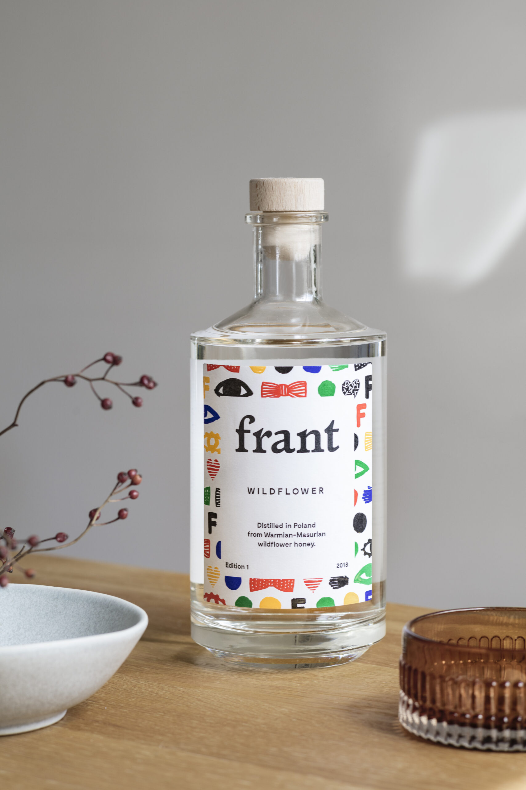
A High Quality Niche. Frant x Filip Pągowski
About building a premium liquor brand; about why it is worth finding our own niche instead of engaging in mass production; and about the pre-war elegance of cooperation with Filip Pągowski. Aleksandra Dobrowolska-Grobel talks to Dorota Żylewicz-Nosowska, Frant brand founder.
See also:
Frant – it is a fantastic word in Old Polish, today practically not used any more. Why did you choose it as the name for your brand? Who or what is Frant by Dorota Żylewicz-Nosowska?
We looked for a Polish word that would be easy to pronounce for foreigners as well. At the same time, the meaning of the word ‘frant’ can be associated with cheeky and carefree way of being. ‘Frant’ seemed also a perfect match for the visual identity that we were preparing for our brand, inspired by Polish functional graphics of the 1950s.
That is how we tend to think of ourselves: a cheeky project that has worked its way among renowned mass produced spirits and niche craft brands of a better quality, but very small-scale and often with a rather crude image.
Why this interest in the aesthetics of the 1950s?
We wanted to break the spell around these years in Poland in the world of our brand. We imagined them as if there had been no dull communism after the war.
What was the origin of the idea to create your own liquor brand?
For over a decade, I have been professionally dealing with wine and premium alcohols. I like to follow the development of gastronomic culture not only in Poland, but around the world. I wanted my Polish peers with a sense of style and aesthetics similar to mine to have an indigenous Polish product they could have been proud of. And quite privately – I missed a truly cool gift from Poland for my friends abroad.

Were you not afraid that the product you were creating might prove a niche one? Or perhaps it was your goal?
Considering the potential of the Polish market, Frant is a niche project, but large scale can be achieved through export. Above all, however, if I had designed a mass alcohol product I would have had to give up the aspects of Frant that turn me on most – first of all, high quality ingredients present in the bottle. It is not possible to build a mass liquor brand in Poland based on high quality ingredients.
Why the idea to cooperate with Filip Pągowski?
We wanted the brand language to refer to the traditional Polish functional graphics of the 1950s and 1960s, when many elements were handmade, mostly because no fonts, pictures, etc. were available. For us, Filip Pągowski is a continuator of that style, but he has also experience in working in a very modern branding context.
Did you know from the beginning that it was Pągowski you wanted to work with, or did you search for someone corresponding to your product positioning?
The brand language was developed by Wojtek Nosowski, my husband and Frant co-founder. Once a moodboard had been created, we practically at once came to a conclusion that Filip would have been a perfect artist for this project. We managed to get Filip interested in cooperation with Frant, and as a result we also have become friends privately.
What was the process of working with the artist like? The artist, I should add, that has cooperated with the global fashion icon CdG?
The process was very informal and, as the saying goes of late, ‘organic’. Filip is not surrounded by a crowd of assistants, agents and account managers. Actually, you could say that he has this pre-war elegance about him, which truly won us over. During a dozen or so email exchanges and face-to-face meetings we worked out a visual language that later on was translated into visual identity by Edgar Bąk.
How does Frant’s visual identity correspond with its flavours?
Wildflower, our first product, is mel aqua vitae, honey vodka. We purposefully avoided references to bees or honey as it does not taste like any previously known liquor produced with the use of honey. And so our choice was ‘multiflowerness’. In this sense, identification is not closely linked to a specific product as there will be more of them in the future.
Was the entire series of symbols on the bottle created at once or was it a process comprising several stages? Are there any symbols not included in the final identification or added later?
The icons were created at the same time. Our cooperation with Filip was long as we took our time wondering together what the final look of the product should be. During the design phase, Edgar Bąk proved inestimable, using elements provided by Filip to design the very label and create the logo.
Creating Frant, did you have in mind some world benchmark as regards product aesthetics or name?
We were thinking quite a lot about what had happened in the perfume market and the boom in niche fragrances about 15-20 years ago. This was a reference point for us when it came to what we wanted to do in the premium alcohol category, where at present ‘overloaded’ forms prevail, with all these bells and whistles and gimmicks. At the same time, a hundred percent minimalism was not our intention, as we can observe some surfeit of labels written in Helvetica on a white background.


